Online learning has been (re)shaped by various educational technology advancements. This means that course designers have numerous options to choose from, including non-physical tools such as media. However, the abundance of choices creates a challenge. Instructors and instructional designers alike need to choose learning media that best align with educational goals. Media only enhances learning when used appropriately, integrated, and in conjunction with suitable teaching strategies (Blaschke, 2014).
Use of media in online courses significantly enhances student engagement and learning outcomes by connecting course content to real-world experiences and presenting it in more interactive ways (Buelow et al., 2018). Despite the proven influence of media selection on learning engagement and performance (Kozma, 1994; Moore et al., 2021), online course designers have access to few systematic evidence-based media selection guidelines. Our research is guided by the central question of: What guides course designers in selecting media for online courses?
Our paper aims to connect theoretical frameworks with practical applications by examining the effectiveness of various media types. We aim to provide course designers with evidence-based, practical guidelines that support effective media selection, addressing both current challenges and future developments in designing courses for an online environment.
This study employed a qualitative approach that synthesizes current research and practices in media selection for online courses. The research design incorporates a systematic literature review to provide detailed and comprehensive insights into the practices of media selection, particularly regarding the inclusion of graphics and videos in online learning.
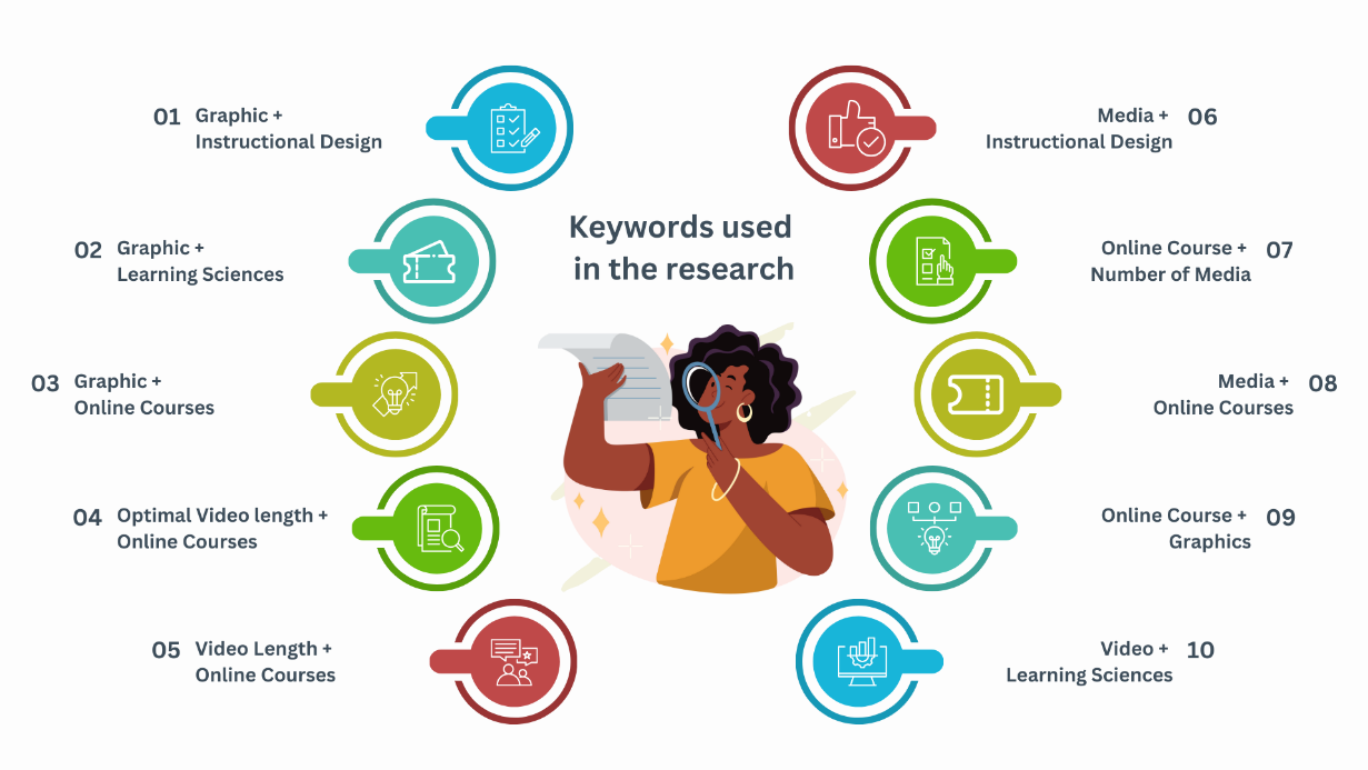
The papers reviewed for this study were obtained using the University’s library databases. To identify relevant peer-reviewed literature, researchers began by agreeing upon a list of appropriate keywords to use (see Figure 1).
Figure 1
Keywords Used to Find Articles
For the analyses, we created a consistent method to extract information from the included articles. We ensured interrater reliability by having independent coding (Dalinger & Asino, 2021). All three researchers independently reviewed and coded the articles. They looked at implementation strategies, effective measures, and trends in media selection.
To ensure methodological rigor, we implemented quality assurance protocols. These include thorough documentation of the analysis process, consensus meetings to settle coding disputes, and frequent reliability checks among researchers. This comprehensive methodology ensured the reliability of our results as well as their applicability in the context of contemporary educational technologies.
The initial insight we gained was that the articles that met our inclusion criterion coalesced around three theories: Multimedia Theory, Cognitive Load Theory, and Working Memory Theory. These theories lay a foundation for understanding how instructional materials should be structured to maximize learning. In the following section, we examine detailed specifications that our research provided as guidelines for course designers for each of the two categories, Graphics (Static & Animation) and Videos.
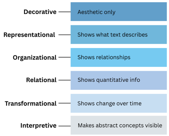
Images are a crucial multimedia element in course design. Prior research (Clark & Lyons, 2011; Carney & Levin, 2002) classifies images based on their functionality (see Figure 2). Research (Dindar et al., 2015; Clark & Mayer, 2011) indicates that decorative graphics are not particularly helpful, while representational graphics (Carney & Levin, 2002) are the most effective types of graphics. Graphics should not be included merely for the sake of having images. Instead, they should be placed purposefully and intentionally, contributing to the learning experience (Clark & Mayer, 2011).
Figure 2
Categories of Instructional Graphics.
Graphics, apart from decorative ones, can be created using infographic formats. Infographics visually organize information to highlight relationships among ideas (Abilock & Williams, 2014). Research indicates that infographics enhance learning (Kapel & Schmidt, 2021; Monroe & Morrison, 2022; Dindar et al., 2015).
Research on infographic design highlights several key principles that guide effective practice. Infographics must be deliberately designed. Every component, such as lines, colors, and text, has meaning and serves a specific purpose. Evaluating these elements is essential to ensure that intended learners understand the central message being conveyed (Ozdamli & Ozdal, 2018). Infographics should support sense-making rather than presenting disconnected or random ideas haphazardly placed (Abilock & Williams, 2014). Selecting accurate and well-researched information sources is also essential, followed by organizing and categorizing the data to visualize it clearly (Kapel & Schmidt, 2021). While designers and instructors may possess subject knowledge, it does not always guarantee the creation of the best graphics, as they might overlook fundamental connections that are not immediately clear to learners. Therefore, feedback becomes crucial (Abilock & Williams, 2014).
Infographics must be designed with learners in mind. They should be aligned with the knowledge level and needs of the target learners to help minimize high cognitive load (Monroe & Morrison, 2022; Kapel & Schmidt, 2021; Ozdamli & Ozdal, 2018). For instance, an image with bright colors might motivate and engage young learners, but the same colors may become too distracting for adult learners. Infographics must therefore be designed in a way that they are relevant to the topic, adhere to design principles, and consider individual learner characteristics; Otherwise, they may negatively affect learners (Ozdamli & Ozdal, 2018).
While we discuss the importance of designing infographics relevant to learners and the positive effects they have on learning, it is also crucial to note that we create graphics that are accessible (Kapel & Schmidt, 2021; Monroe & Morrison, 2022). Monroe and Morrison (2022) note that graphics not designed with learners with disabilities in mind can further marginalize them. Their guidelines for accessibility primarily depend on two factors: using accessible non-contrasting colors and writing the alt text more intentionally. They also suggest avoiding redundancy in the alt text to manage working memory.
While it has been suggested that decorative graphics do not aid in learning, our findings contradict this notion. Bader et al. (2022) found that decorative graphics can be helpful in online courses when intentionally used. From their work, a category of decorative images emerged: personalization. Although these images are not directly related to the text, they can provide metaphorical representations of the content and enhance user experience. For example, such images can create personalization in a course through humor or offer visual cues by color-coding course sections.
Our literature review found no significant differences in learning outcomes between animated and static graphics, and in many cases, static graphics were more effective. Rebetez et al. (2010) suggested that animated graphics can challenge human processing and increase cognitive load because learners process multiple frames of information simultaneously. However, they also found that animation enabled by collaboration improves learning outcomes, as it has the potential to engage students in joint problem-solving activity that leads to shared meaning-making of the visualized events (Karlsson, 2010). Additionally, Brasier et al. (2019) note that students learn better when animations are placed close to feedback exercises, in line with the multimedia theory.
Videos are essential in e-learning, simply adding them won't improve learning outcomes (Zhang et al., 2006). Research shows that for instructional videos to boost student engagement and help learners reach their goals, they must be intentionally designed and integrated. (You & Yang, 2021). Short videos consistently produce higher engagement and better learning outcomes (Zhu et al., 2022). When it comes to video design, educators think the ideal length is between 6 and 10 minutes (You & Yang, 2021). Including captions and transcripts can also improve accessibility for screen reader users and learners who don't speak English as their first language. Overall, the best practice is to create short, high-quality instructional videos that balance clarity, accessibility, and cognitive load (You & Yang, 2021).
Furthermore, learning isn't a straight path. People often build knowledge by considering different viewpoints (Schneps et al., 2010). This is where videos can be beneficial; they can do more than just repeat or replace text. For example, in an environmental science course, Schneps et al. (2010) used a video on glacier research to demonstrate real-world procedures. This allows students to observe details that text alone cannot easily convey. This real-world footage gives context and insight that enhances learning beyond what a written explanation can provide.
We acknowledge limitations in our study. While we looked at videos generally, we did not explore specific areas like audio-only formats, simulations, or detailed video design variations. Therefore, our findings focus more on graphics. Future research should investigate these additional media types to offer a better understanding of their impact on learning.
Another important area involves AI-generated images, where issues of accuracy, bias, and proper instructional use are not yet fully examined. Expanding work in these areas will improve evidence-based guidance for media selection in online course design.